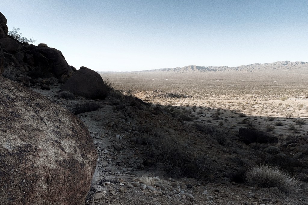
The subdued color lens itself to the desert, especially in bigger scenes like this. I still prefer the b/w for more intimate subjects. But this one is cool. Nice blend of light and shadow with good foreground texture to contrast with the soft pastel sky.
For me color has a whole different set of challenges. To my mind it can’t reach into the heart and guts and hard-edged spirit of the desert like b/w can – it needs a different approach – but there are possibilities worth exploring. Your thoughts are always appreciated Frank.