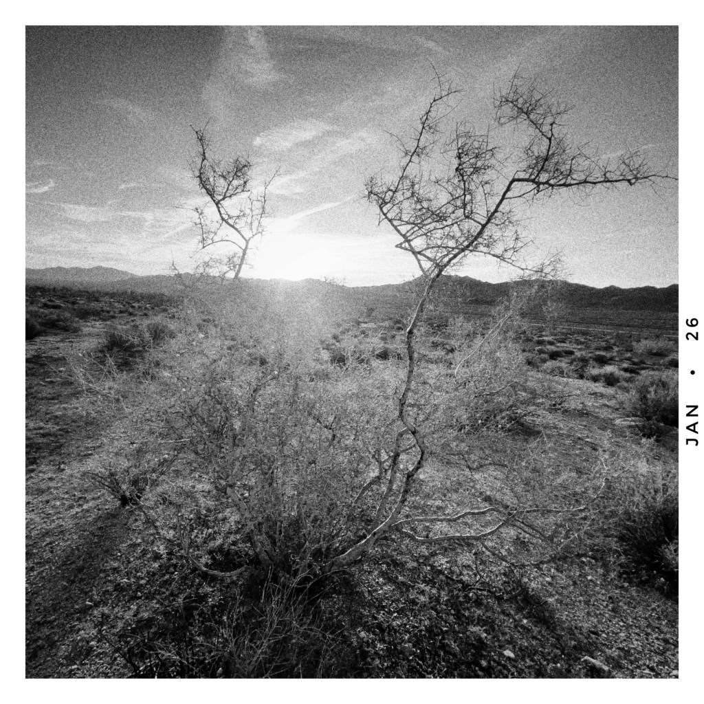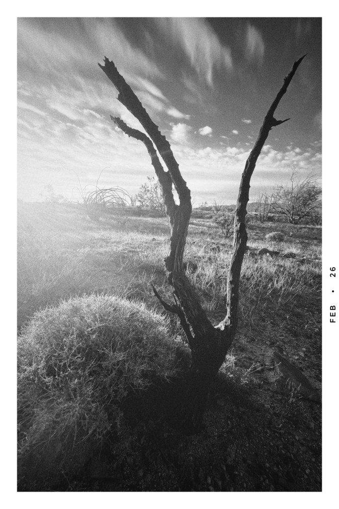
sunrise in the park
In the very end, civilizations perish because they listen to their politicians and not to their poets – Jonas Mekas
I’ve struggled with color for several years now. I can be pretty slow on the uptake – try as I might I haven’t been able to get the same gut punch with color as I can with b/w, and I’ve quickly abandoned it.
It finally occurred to me that I won’t get the same punch with it and it’s an exercise in frustration to try. Color speaks in a different voice. It has a voice of it’s own, and if I let it be what it is, and let it speak in it’s own voice, I can get along with it just fine. It can even be pretty good.
Of course it helps to figure out how to tame it…

Years back when I was a kid, the late 50s and early 60s, I used to play around with a Kodak Brownie Starflex that my parents had once given me for Christmas. I used 127 roll film, usually Verichrome Pan, occasionally Kodacolor for color. I never used it seriously, I would just run around taking snapshots once in awhile. Sometimes I would use my dad’s Argoflex. A simple twin lens box that used 620 film. We’d take them down to the local drugstore to get developed, and a week or so later I’d get back these square prints with a white border and a date stamp along the edge. Those snapshots were magic.
Years later, in the mid-70s, I got more interested in photography. I bought myself a reasonably good 35mm SLR, a Yashica TL Electro. I got some Kodacolor film and started snapping. I was hooked. I added a Yashicamat TLR to my bag, and tried some black and white film too. Tri-X for the 35 and the venerable Verichrome Pan for the 120. I started shooting and never looked back.
Then I made the grave mistake of thinking ‘man, this would be a great way to make a living. I’m gonna be a pro’. I read everything I could get my hands on about being a professional photographer. I followed all the accepted advice, did what I thought you had to do, and quickly settled in to a certain level of mediocrity. It ruined me for years.
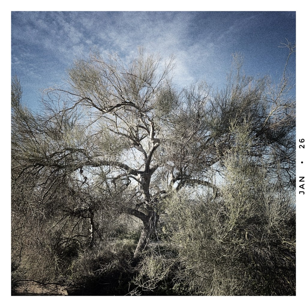
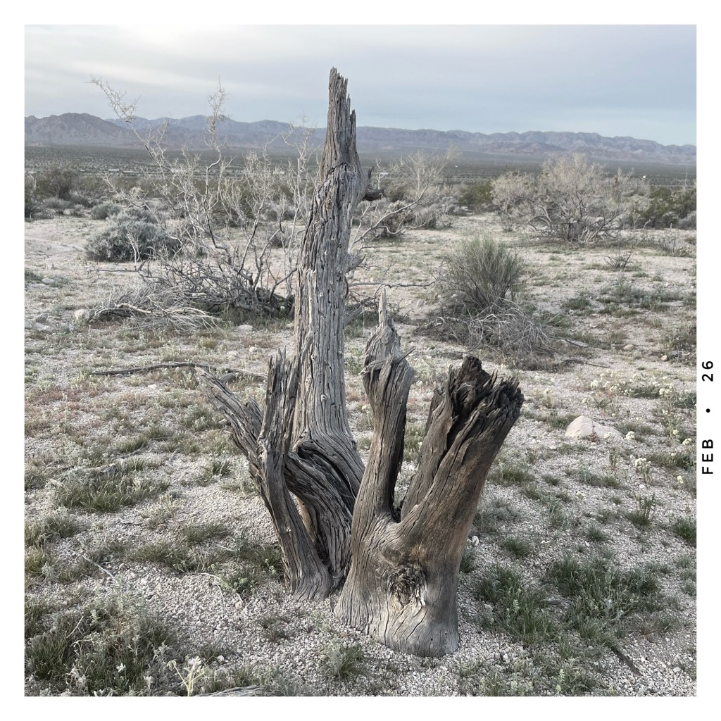
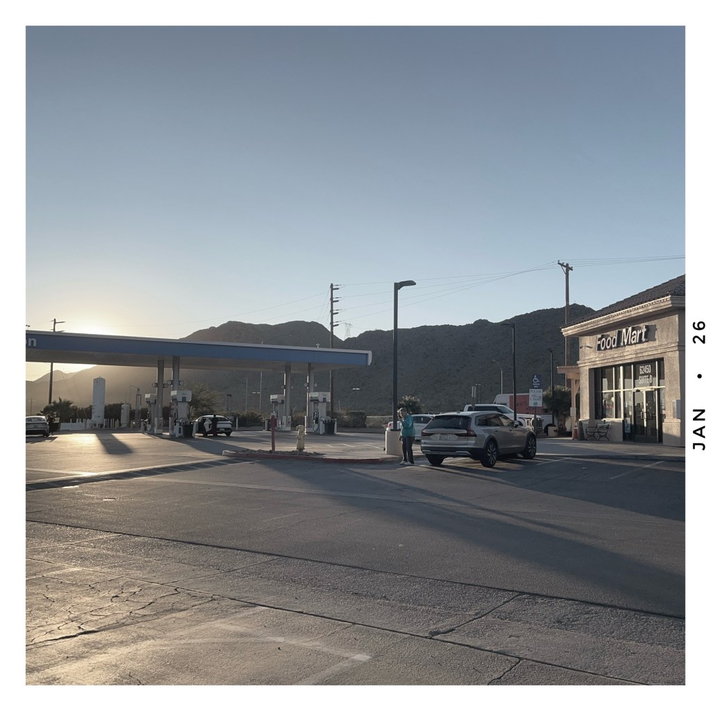
These days I shoot with nothing but a phone. Have for about ten years. For me it’s the perfect instrument. I can do everything I want to do with it, and it slides right into my pocket. I often start to take myself too seriously. I start to think too hard about making ‘art’, which is fine, but it can start to take the fun and spontaneity out of it. Every now and then I just go out and take snapshots like I did as a kid, both black and white and color, just take what I get out of the camera without any post-processing except for the border and date stamp. Back to the basics. It’s very freeing, and you know something? The magic is still there if you let yourself find it.